


Interiors, like fashion, are cyclical, and each season new trends arrive to make us question why our humble abode isn’t more on trend. Fear not, however – we’re on hand with all the trends for interiors this spring and some advice on how to use them wisely.
Monochrome
One thing to remember with interiors is that, unlike fashion, once you commit fully to a trend you could be stuck with it for years in your home. So sometimes less is more, and this is certainly true of the monochrome trend right now. Don’t use monochrome to update an entire room with (that’d be far too Beetlejuice), but instead add accents of it in accessories. One place this will work well: the kitchen.
Check out this great range of plates from M&S – they’re just the thing to nod to this trend without it becoming a nightmare in black and white.

Grey
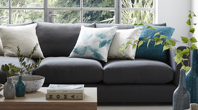
This colour was huge in the last few years, and despite beige dominance, it looks set to stick around in 2026 too. In terms of your home, it’s actually very practical. Items like grey sofas, curtains or carpets won’t date your space, and even as the focal point of a room can be updated in a few years’ time with accessories. We love it because of how calming and grown-up it makes a room feel. Maybe start with a few throws or, if you can afford it, invest in an angular couch like this one from Debenhams.

Rose Quartz and Serenity
Colour expert Pantone has named this colour pairing the one to watch this year. So what colours are these? Think light pink and light blue combined. Pantone predict that a full, muted colour pattern of pastels will be what we’re raving about as the year progresses.
How should you use it in the home? These colours match extremely well and can be paired together in everything from cushions and throws to bedding, curtains and lamps (like this set from Next).

This pairing is definitely seen strongly in accessories that are already available in stores.
The statement cushion
There was a time when you matched you cushion to the colour of your curtains or your walls and left them to languish on the sofa for a few years, unnoticed. Not so anymore. Cushions have staged something of an uprising in the past few years and now it seems the rule of thumb is that the bolder they are the better it is for your home. Graphic prints, color pops and bright patterns are all taking center stage at the moment. We love these ones from House of Fraser.

Want, want, want…
The dining table
Long abandoned in favour of enjoying meals on our laps in a living room, the humble kitchen/dining table is making a comeback, and it’s time to show it some love. The first step is to remove all the clutter you’ve been storing on it while you’ve been ignoring it. Then, it’s time to embrace the world of tablecloths. Add a pop of colour or keep it traditional with something like this blue and white one from Penneys.

You can then go wild matching in napkins, candlesticks, placemats, cutlery and all that other fun stuff that comes with table dressing. Can you tell we love this trend?
70s showtime
It might be time to raid your mother’s garage or attic because the 70s trend will be a permanent staple in 2026. Midcentury with a bit more personality popped its head up at the end of 2025, and looks set to stay the course. We love the graphic prints on walls, floors and textiles that come with this trend and the orange and rust hues that really warm a room.

Furniture is important too with the angular light oak, favoured of that decade, really making a return to our homes. A word of caution, however. Much like vintage fashion, you want this look to be a homage to the time rather than a direct recreation which can look like a bit dated. Think accents and the odd statement piece rather than a full 70s home.
And finally… Go grand
Or go home, that might be the saying to define the trend for chandeliers that looks set to explode in 2016. It doesn’t have to be megaexpensive though; most highstreet stores will have something for every budget that won’t break the bank. This kind of lighting works best in areas like halls or landings where you can really show off your bit of bling to visitors. This one ages quite well too, so spending a bit more, if you like, isn’t a silly thing to do. Just make sure you hang it correctly or get help from an expert if needs be.

What are you doing to update your interior this year?
PHOTOCREDITS marked on images, all courtesy of brands. Article created in partnership with aransweatersdirect.com.


I am doing a lot of Grey. White will be. A big pet of the living room. With soft lavender, real or rose accents. It will change room to room but it will connect. Hopefully when I am done, that is.
Sounds gorgeous! Thanks for commenting 😉
To me monochrome means any color, but only one color. But here it sounds like you’re using it to mean black-and-white.